How did Edward Fella change typography?
Introduction
Edward Fella or Ed fella is a recognisable name for many designers today. He is an inspirational graphic designer and artist whose main focus is typography. Born in 1938, he attended school in Michigan with the intent of learning various art forms and techniques in which he had developed over the years. After his learning, he started his promising career as a commercial artist and has been for 30 odd years.
Career & Work
His brilliance has lead him to develop multiple typefaces and as a AIGA medallist Lorraine Wild states, his work
“marks a sea in change in graphic design” —Lorraine Wilds, AIGA
His approach to design has certainly sparked an important change in contemporary typography. It is evident that his career as a designer was very successful. His contribution to the idea of Postmodernism is similar to his ideas. In the article, Postmodernism in Graphic Design-Edward Fella-The Rebel, Adam Breckons states,
"Similar to Fella, Postmodernism rejected the idea of logical systematic design favouring themes like chaos, complexity and distortion".—Adam Breckons, AIGA
His use of hand typography has opened a door for an unusual approach to his work". His role as a pioneer of postmodern was certainly deserving. Many of his acts is seen as a unusual or different compared to the likes of Joseff Muller Brockmann. He was one designer that caught my eye and found interesting to conduct my research. I was able to find his style of creating typography and learnt a lot of lessons that I could use as a design student. He was a very odd and extreme artist in typography but his style was used to make great forms of art.
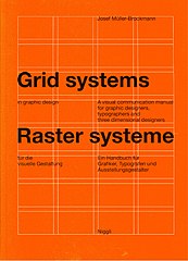
His choice of rejecting or not choosing to follow the rules and tight grid structure of modernism has lead him to become a pioneer in the postmodern section. His decision to break all rules relating to typography gave him the “ formal explorations opened up so many new avenues within graphic design. The quote was gathered from the article "Postmodernism in Graphic Design-Edward Fella-The Rebel". The quote states that because of his initial decision to not follow rules, he had discovered new ways or approaches in graphic design. He embraced a postmodern approach to design, developing his own distinctive. This decision of his made multiple new ways of creating art in graphic design. Ed's Uniqueness is shown through this decision because it shows how his thinking and ideas differ from other artists. While most artists follow the swiss style of typography, Fella's approach differs to the swiss style of typography. Compared to Josef Muller Brockmann, Ed Fella very much differs from Jossef's swiss style approach. The idea of swiss modernism uses grid structure in their work, defines one type of artistic meaning only and uses sans serif typeface. This approach is consistent and can be clearly seen in Brockmann's work. Fella however, uses no grid structure for his work, uses multiple typefaces-fella, Outwest etc. His illustrations and letter uses no grid to structure his work. The main reason behind his reasoning is to do with his random approach to his artwork. His focus when starting a project is to know how to start a project but no plans on how it concludes. His mind creates many endings and changes can occur at any time if he wishes. Usually, when we learn about designers, we think of that they develop their own style by following all the rules of typography and design. It's that sort of idea of learning from previous projects and ideas develop new ideas and projects. Ed didn’t follow or did not liked to follow the rules which makes him unique in a sort of way. This way he was able to create his own style/approach by doing what he enjoys
 Josef Muller Brockmann, Juni-Festwochen Zürich (poster, 1957)
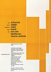 Josef Muller Brockmann, Grid systems (book, 1981)
Fella had used cheap typography to carry out his art . In his time Ed didn't use or haven't asked for the help of computers or software to carry out his work. So what was his approach to creating his art? His main source of tool is simply using colouring pencils and sketchbooks. Sounds simple but very effective to his work. In my opinion, I believe that this is an important that I take from his teachings. This shows that computers and other design do not always need to be used in order for high level art to be created. The use of cheap colouring pencils and sketchbooks can produce the same results and can be just as effective. It’s that idea of creating our prototypes on paper first rather than jumping straight to the software.
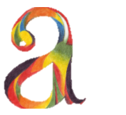
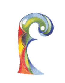
He has developed two of his own typefaces-"fella" and "Outwest" Both typefaces were created in 1993 in Émigré. Fella or a Fellaparts is an alternative name for his own typeface. Both of Fella's typefaces are displayed in emigre's website to use and to look at. His typefaces came from his own experiments in typography and design. Ed Called almost all his work the phrase, "Getting it Wrong". Ed style of Art is where he does everything wrong or in a unusual way . This is one of the reasons why I tend to call the man odd and extreme in the world of typography. The phrase may very well come from his choice of not following the rules.
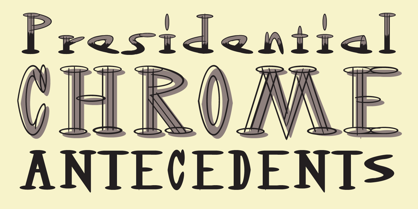 Outwest Typeface,1993, Emigre Fonts
 Fellaparts Typeface,1993, Emigre Fonts
Postmodernism
"Fella’s postmodernism work inspired the new graphic design generation to explore and be more creative in their work. He was able to inspire many others through his work and clever forms of teachings in his days as a lecturer in design. His successful career as an artist lead him to receive the AIGA award in the year 2007. In AIGA's website it clearly shows that during his time working as a commercial artist he was very successful in his works. .
The concept of postmodernism was inspired by Fella’s fascinating artwork. He mainly constructed artwork known as expressive design which we can understand and clearly see. His use of expressions in his typography and his style of typography can relate to expressive design. He had used unique experimentation to construct his style of art. His use of expressions in his work and his contribution to expressive design has lead him to reject the rules of modernism in general. His rejection towards modernism has lead him to focus on postmodernism and he has been a artist to look out for in the movement. He has the honour to massively support and inspire the movement.
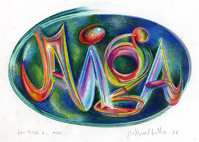 Ed Fella, AIGA
Conclusion
Finally, he ended his career by encouraging other artists to make their work more "eccentric" and "Quirky" (reference?) as possible. Quirky meaning weird or uncommon style of art. Eccentric having the similar definition, having uncommon features and odd choices of art. What I learnt from his words is that all artists and designers should be free to create their own type of art without having any disruptions or disadvantages. Fella wanted the new generation of graphic designers to follow his words and to use his work as inspiration.
Bibiography
Breckons, A. (2018, August). Postmodernism in graphic design-edward fella-the rebel. Retrieved from Meduim.com.
Carducci, V. (2007, September). Ed fella. Retrieved from AIGA
Dooley, M. (2013, May). Words-and images-on ed fella. Retrieved from Printmag.
Ed fella. (n.d.). Retrieved from Design is history.
Edward fella. (2020, November). Retrieved from Luc.devroye.
Poynor, R. (1996). Fellapages. Retrieved from Eyemagazine.
Swiss modernism. (2017). Retrieved from gdpsu.